

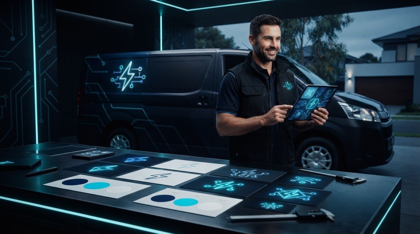
A lightning bolt can identify an electrician, but it won’t make a business memorable on its own. The right logo needs to look professional rather than generic, stay legible on a van or uniform, and feel at home on a phone screen. That matters because website design for electricians should carry the same visual identity into a clear, credible online experience, not leave the logo working alone.
If you’re unsure whether to choose a plug, wire, spark or a more distinctive wordmark, you’re not alone. A strong direction balances trade relevance with a recognisable detail, then uses colour, typography and a simple layout consistently across customer touchpoints. This article explores practical logo ideas for electrical businesses and explains how to assess them at different sizes and in different settings. You’ll also see how bespoke website design, supported by clear copy and intuitive user experience, can connect that identity to service pages and straightforward enquiry pathways, helping your brand look cohesive wherever customers meet it.
Key Takeaways
- Choose a logo direction that feels relevant to your electrical business without relying on an overused symbol alone.
- Test the design at small sizes and in one colour so it remains clear on screens, vehicles and uniforms.
- Use the 12 concept directions as a starting point for shaping a distinctive visual identity.
- Build website design for electricians around consistent colours, readable headings and clear paths to enquire.
- Bring your identity to life online with bespoke website design, supported by purposeful copywriting and intuitive UI/UX.
Why electrician logo design ideas need to work beyond the first impression
Customers should be able to recognise an electrical business quickly, whether they find it on a phone or spot its van on the road. A professional logo helps create that first point of recognition, but its job is specific: identify the business and give its wider brand a consistent visual anchor. It can’t explain every service, prove workmanship or replace clear information about what the business does.
A useful trade-business logo identifies the business clearly, hints at its work and stays legible wherever customers see it. That’s the practical test to apply to any design direction. The concept of a logo centres on a visual mark that identifies an organisation; for an electrician, that mark needs to work alongside the name, service descriptions and other cues that help customers decide whether the business suits their needs.
What should an electrician logo communicate?
Start with recognition. The business name should be easy to read, while the overall design should give a quick sense of the electrical trade. A simple motif, a carefully chosen letterform or a distinctive wordmark can all do this. The strongest option depends on the business’s positioning, not just on which symbol looks most familiar.
A residential electrician might want a welcoming, approachable feel, while a commercial operator may favour a more structured, technical look. A specialist business could signal its focus through a short descriptor used alongside the logo, rather than squeezing several service references into the mark itself. Keep the design focused: too many symbols, words or visual effects compete with the business name.
A plug, bolt or light bulb can suggest electrical work, but familiarity alone doesn’t communicate reliability or service quality. Those impressions build through the complete customer experience, including clear service information and consistent presentation. A logo can support that impression; it can’t make the case on its own.
Where will customers see the logo?
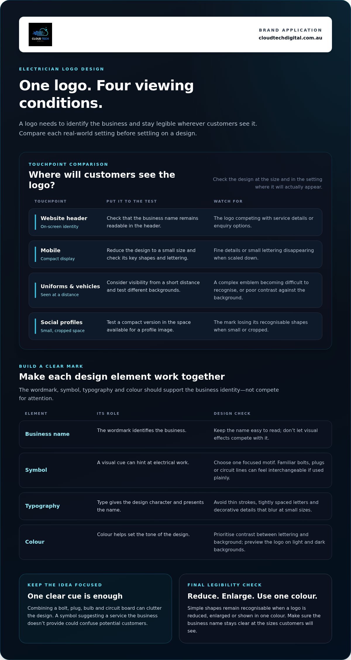
Think beyond a large screen mock-up. Customers may encounter the logo in a website header, a mobile browser tab, a social profile, on a uniform or across vehicle signage. Each setting changes how much detail people can see. Fine lines and small lettering may disappear on a compact screen, while a complex emblem can become hard to recognise from a distance.
- On a website: Check that the name remains readable in the header and doesn’t compete with service details or enquiry options.
- On mobile: Reduce the design to a small size and see whether its key shapes and lettering still hold together.
- On uniforms and vehicles: Consider visibility from a short distance and whether the mark works against different backgrounds.
- On social profiles: Test a compact version that remains recognisable when displayed in a small, often cropped space.
These checks connect branding directly to website design for electricians: the logo should fit naturally into a usable, informative site rather than dictate the whole experience. Clarity across customer touchpoints matters more than decorative detail. If a design only works when it’s large, it isn’t ready to represent the business everywhere customers might look.
Build a clear electrician logo with colour, symbols and readable type
A logo usually combines a wordmark, a symbol, typography and colour. The wordmark presents the business name; the symbol adds a visual cue; and the type and colour give the design its character. These elements need to work together, not compete. A strong concept can be distinctive without making customers work to read the name or guess what kind of business it represents.
Judge each choice in context. A mark that looks polished on a large screen may lose detail on a mobile header or vehicle signage. Simple shapes reproduce more reliably because they remain recognisable when a logo is reduced, enlarged or shown in one colour.
Choose symbols that feel relevant without looking interchangeable
Lightning bolts, plugs and circuit lines are useful starting points, not compulsory ingredients. Used plainly, they can make a logo feel familiar but also easy to confuse with other electrical businesses. For a more individual direction, try shaping an initial into a simple geometric mark, or use a subtle reference to wiring or a connection within the lettering.
Keep the idea focused. Combining a bolt, plug, bulb and circuit board can clutter the design, while a symbol that suggests a service the business doesn’t provide could confuse potential customers. Choose one clear visual cue, then let the business name and service information do the rest.
Select colour and typography for legibility
Colour can help set the tone: a bright accent may suggest energy, while a restrained palette can feel dependable or contemporary. These associations aren’t fixed rules, so consider what suits the business and how the colours work together. Guidance on visual identity standards also highlights the role of consistent colours, fonts and logo use in presenting a recognisable brand.
Prioritise contrast between the lettering and its background. Choose type that’s clear at a glance, and avoid thin strokes, tightly spaced letters or decorative details that blur at small sizes. Before settling on a concept, view it at the size it will occupy in a website header and social profile, then check that the name remains easy to read.
- Check colour: Preview the design on light and dark backgrounds.
- Test one colour: Confirm the mark still works without its full colour palette.
- Compare formats: Check RGB versions for screens and CMYK versions for print-oriented uses, as colours can appear different between them.
These practical checks make it easier to carry the identity into website design for electricians, where the logo must sit comfortably alongside page headings, service details and enquiry options. A cohesive website can bring those elements together through considered design and clear copy. Explore bespoke website design for trade businesses as a way to connect your visual identity with a useful online experience.
12 Electrician logo design ideas, from bold wordmarks to subtle circuit marks
Use these directions to explore what might suit your business, not as ready-made solutions. Adapt the visual approach to your name, audience and actual services. A concept for a residential electrician may need a different feel from one aimed at commercial or specialist work. Sketch a few options, then consider how each would sit alongside your website content and customer communications.
Modern and minimal logo directions
These concepts favour clear shapes and typography, giving the business a contemporary feel without relying on a crowded collection of trade icons.
- Bold wordmark: Set the business name in confident, legible type. It can suit an established operator whose name is already a key point of recognition.
- Initials monogram: Combine one or two initials into a compact mark. A useful direction for a short business name or a design that needs to fit neatly into a social profile.
- Negative-space spark: Form a small electrical reference in the gap between letters or shapes. This adds a subtle detail for a brand seeking a clever, understated look.
- Geometric bolt: Reduce a lightning bolt to a few clean angles. It can suggest energy for a general electrical business without adding unnecessary illustration.
- Current-inspired line: Use one continuous line to hint at a flow of electricity. Keep the form simple for a contemporary business that wants a softer alternative to a bolt.
- Letter-and-symbol lock-up: Pair a compact symbol with the business name. This flexible arrangement may suit a growing business that needs a full and abbreviated version.
Established, specialist and approachable directions
Other styles can help express the way a business works with customers. Keep the visual cues tied to the real offer, and avoid suggesting a service the business doesn’t provide.
- Trade badge: Place the name inside a simple shield or circular frame. This can give a long-running business a structured, established feel.
- Precise circuit motif: Add a restrained track or connection detail. It may suit a technical or specialist operator, provided the lines stay clear at small sizes.
- Rounded wordmark: Choose softer letter shapes for a friendly, approachable tone. This could suit a residential business focused on direct customer relationships.
- Abstract connection mark: Join two or three simple shapes to suggest a completed circuit. It offers a less literal option for a business seeking a distinctive identity.
- Framed service descriptor: Pair the name with a short descriptor that reflects the actual work. This can help a specialist business clarify its focus without crowding the main mark.
- Single-colour stamp: Build the design to work in one colour from the outset. This pared-back direction can suit a business wanting a consistent, practical mark across digital and physical uses.
Shortlist the concepts that reflect your customer base and genuine service mix. Then view them in context: website design for electricians should make the identity feel connected to the page, while keeping service information easy to find. The best direction is the one that feels distinctive and remains practical wherever customers encounter it.
Turn an electrician logo concept into a usable website design brief
A logo concept becomes more useful when you plan how it will work across the whole online experience. A clear brief helps connect the visual direction with the business’s real services, the customers it wants to reach and the actions visitors should take. It also gives a web design project practical criteria to work from, rather than relying on personal taste alone.
Write a useful brief before developing the visual identity
Start with the essentials: the exact business name, the services offered, the intended audience and the impression you want the brand to create. For example, a business focused on residential work may want an approachable tone, while a specialist operator may prefer a more technical feel. Keep the brief grounded in the actual business, not a list of services or qualities it can’t support.
Next, gather a small set of visual references. Note what appeals in each one, such as the lettering, colour balance or simplicity, and what you’d avoid. The goal is to explain the direction, not copy another business’s identity. Record where the logo will appear, including website headers, social profiles, uniforms and vehicle signage. These uses affect how much detail and variation the design needs.
Check the identity in its real website context
Review the logo in a desktop header, a mobile header and a browser tab. Each view reveals a different challenge: the desktop version needs to sit neatly alongside navigation, the mobile version must fit a tighter space, and a browser tab may only show a small icon. Check that the colours, logo and text remain distinct against the website background.
Then look beyond the header. Brand colours should support readable headings and body copy, while service descriptions should explain the work clearly rather than relying on visual cues. Calls to action, such as a phone link or enquiry form prompt, need to be easy to spot and use. On a phone, test that contact options are accessible without excessive scrolling and that page elements don’t feel crowded.
Page structure matters too. Organised service pages help visitors find relevant information and can support search visibility when each page has a clear purpose. Explore practical SEO for tradies principles as you plan how customers will move through the site. For a joined-up approach to layout and brand presentation, review web design for tradies. Strong website design for electricians brings these elements together so the identity supports, rather than distracts from, the customer journey.
Cloud Tech Digital creates bespoke websites for trade businesses, bringing design, development, copywriting and UI/UX together. Explore website design for your trade business to plan a coherent online experience around your services and enquiry pathways.
Bring electrician website design and brand identity together
A logo is only one part of an electrician’s website. It helps establish visual recognition, but visitors also need clear service information, easy-to-use pages and obvious ways to enquire. When these elements work together, the site feels consistent and professional, giving potential customers a clearer picture of the business and how to take the next step.
What a cohesive electrician website should bring together
Carry the visual identity through the site with considered use of the logo, colours and typography. Consistency doesn’t mean repeating the same graphic everywhere. It means using a recognisable style that supports the content, from the main navigation to service-page headings and enquiry prompts. Make sure the logo sits comfortably in the header without taking attention away from the information customers came to find.
Good structure does practical work. Use straightforward navigation to help visitors reach relevant service pages, and write descriptions that explain what the business actually does. Avoid vague claims or a long list of services that don’t reflect the work offered. Clear, specific copy helps people decide whether they’re in the right place.
Make enquiry options easy to find and understand. A visible phone link or a clearly labelled form can give visitors a direct route to get in touch. On mobile, check that buttons are easy to tap, headings are readable and essential details don’t disappear beneath oversized branding. Effective website design for electricians connects visual presentation with usability, so the site supports a straightforward customer journey.
Plan the next step for your electrician website
Before planning a redesign, define what the site needs to do. Write down the services you want to explain, the customers you’re aiming to reach and the action you want visitors to take. That might be calling, sending an enquiry or viewing a particular service page. These priorities give the design and content a clear purpose.
Cloud Tech Digital creates bespoke website design and development for trade businesses, supported by copywriting and UI/UX. That means the visual identity can inform the page layout, while clear copy and considered user experience help visitors navigate services and enquiry pathways. The aim is a coherent online presence shaped around the business, not a promise of a particular number of leads.
Cloud Tech Digital has worked with trade businesses since 2020. If you’re ready to plan a more cohesive online presence, discuss your website project with the team. A clear brief is a practical place to start.
Make your next brand decision work harder online
Your logo can be the starting point for a more deliberate online presence. Before making changes, decide what you want customers to understand about your business and what you want them to do next. That gives your visual identity a clear role and helps keep every page focused on the people you want to reach.
Effective website design for electricians brings the brand and customer journey together, so the site feels recognisable while making it straightforward to explore services and enquire. A carefully planned website can turn a visual direction into a practical digital experience, with each design and content choice serving a purpose.
If you’re ready to shape an online presence around your trade business, take the next step with Cloud Tech Digital. Talk to Cloud Tech Digital about a website built for your trade business and start planning a site that reflects your business and supports its next stage of growth. A clear direction now can make it easier to build a brand customers remember.
Frequently Asked Questions
Can an electrician logo use a lightning bolt without looking generic?
Yes, a lightning bolt can feel distinctive if it’s tailored to your business rather than used as a stock symbol. You could shape its angles around an initial, create a unique outline or use the bolt as a small detail in the lettering. Before settling on it, compare your concept with other electrician brands you encounter. If it feels interchangeable, adjust the form or explore a less literal visual cue.
Should an electrician use the business name or initials in the logo?
Use the full business name as the main version if customers need to learn or recognise it. Initials can work well as a compact companion mark for a social avatar or other space where the full name is difficult to fit. Check that people unfamiliar with your business can still connect the initials to the name. If they can’t, keep the full wordmark prominent and use initials only where context makes their meaning clear.
Is an AI-generated logo suitable for an electrical business?
An AI-generated concept can help you explore visual directions, but review it carefully before using it as your finished identity. Check that the business name is spelt correctly, the symbol looks intentional and the design doesn’t resemble a generic template. Also review the tool’s terms for how generated work can be used, and whether you can obtain the file formats you need. A concept that needs substantial correction may be better treated as a starting point, not a final logo.
Can one electrician logo represent residential and commercial services?
Yes. One core identity can represent both, while your website explains the difference through service-page headings, examples and descriptions written for each audience. In website design for electricians, this lets customers find relevant information without having to work out whether separate logos represent separate businesses. Keep the brand mark consistent, then tailor the surrounding page content to the service being discussed.
How often should an electrician update their logo?
There’s no fixed timetable. Consider a refresh if the business name or focus has changed, if the current artwork no longer suits the business, or if the available files make routine updates difficult. A refresh doesn’t always mean starting again: refining the lettering or simplifying a detail may be enough. Before changing it, list where the logo appears so you can update key customer-facing materials consistently.
Do I need a different logo for emergency electrical work?
Usually, one business logo is enough. If emergency electrical work is part of your actual service offering, explain it with a clearly labelled page or section under the same brand. State the service scope and relevant contact process plainly, so customers understand what they can enquire about. A separate logo may add confusion if customers can’t tell whether it represents a different business or a distinct service.
